
BRAND
Color Palette
The Chapelle color palette can be used in any combination but the primary colors should always be the dominant colors in any design. Black and white must always be accompanied with primary colors. Accent colors should be used with a white background.
PRIMARY COLORS

#457D58
RGB: 69 - 125 - 88
CYMK: 80 - 31 - 82 - 17
Lush Green

#175933
RGB: 23 - 89 - 51
CYMK: 94 - 40 - 100 - 43
Green Pea

#BEE5C3
RGB: 190 - 229 - 195
CYMK: 26 - 0 - 30 - 0
Lime Sorbet
SECONDARY COLORS

#E0F1E6
RGB: 224 - 241 - 230
CYMK: 11 - 0 - 11- 0
Panache

#000000
RGB: 0 - 0 - 0 - 0
CYMK: 75 - 68 - 65 - 90
Black

#FFFFFF
RGB: 255 - 255 - 255
CYMK: 0 - 0 - 0 - 0
White
ACCENT COLORS

#FDD851
RGB: 252 - 216 - 81
CYMK: 2 - 13 - 84 - 0
Mustard

#FDD851
RGB: 253 - 216 - 81
CYMK: 6 - 75 - 29 - 0
Deep Blush

#6EC8F5
RGB: 110 - 200 - 245
CYMK: 52 - 4 - 0 - 0
Malibu

Logos
The Chapelle crest is the primary logo for usage on all branded items. The crest and chipmunk are considered stand alone brand logos and should
not be used together on any designs. Chapelle crest can be converted to other primary shades of green or white, as needed.
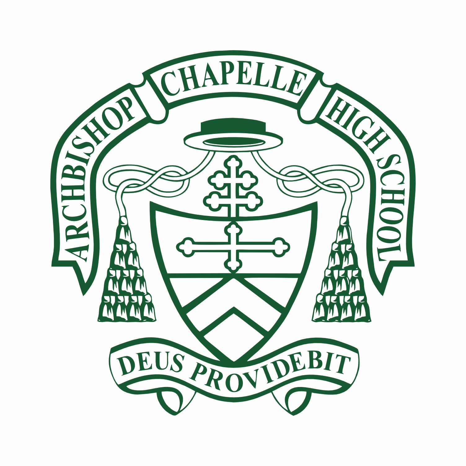
Crest
Used for:
All communications, print materials, uniform sweater, apparel, and branded signage.
Traditional and Timeless

Crest Horizontal
Used for:
Mailings, signage, school promotion, invitations or flyers, as needed.
Professional and Confident

Chipmunk
Used for:
Admissions, summer camp, internal events, gifts, and anything mascot related.
Cheerful and Engaging
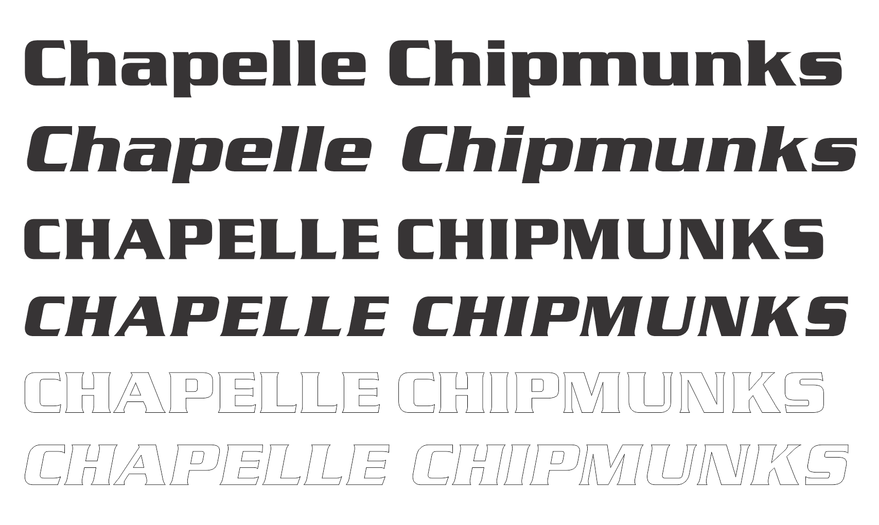
Typography
The Chapelle tyopgraphy includes 3 approved font families plus one additional font for athletics. These fonts can be used in any combination but paragraph and detailed text should always be Monserrat for ease of reading. All fonts can be used for headers.
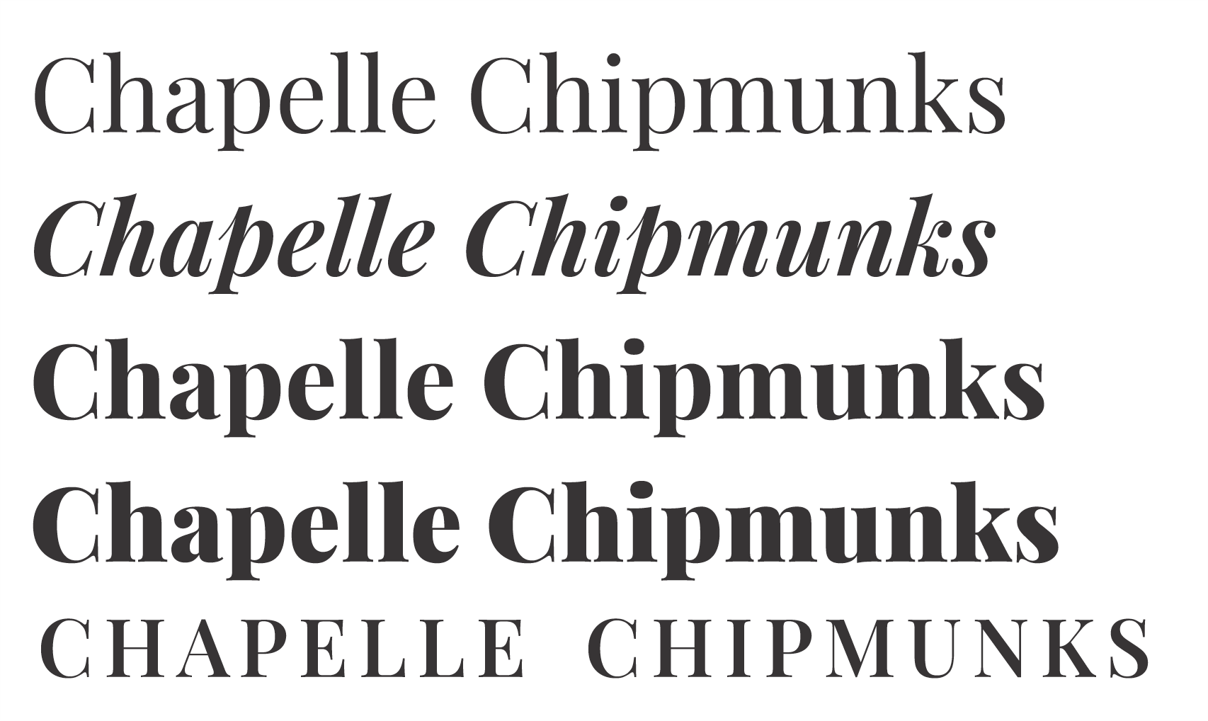
Playfair Display
Used for:
Headers, large typeface needs. Looks great bold and itialized.
Polished and Feminine
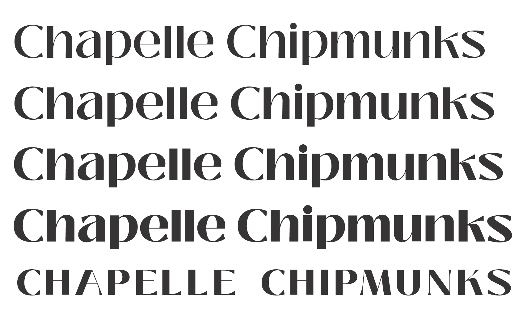
Black Mango
Used for:
Headers or promotional items. Looks great bold and used for emphasis.
Modern and Chic

Monserrat
Used for:
Paragraph text or headers in all caps. Great for flyers or print materials with lots of details.
Clear and Informational
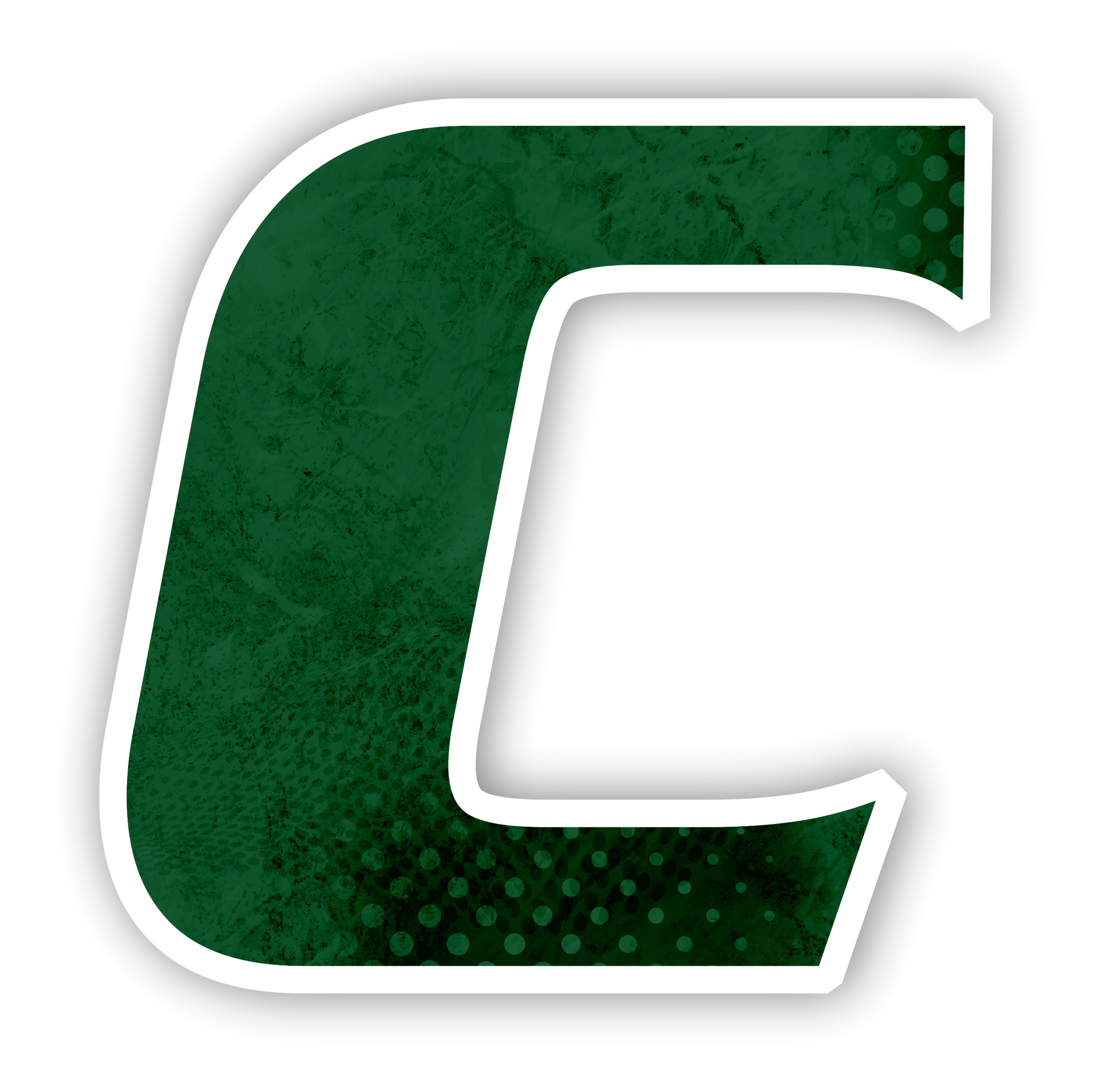
Athletics
The Chapelle Athletics Department does maintain a seperate brand kit. The Athletic
C
is the official logo and can be accompianed with Serpentine fonts for specific sports or descriptions, i.e.
C Softball. Teams will used the approved brand on uniforms and promo.


Need additional assistance?
Contact Jamie Hanzo '17 | Director of Marketing & Public Relations
jhanzo@archbishopchapelle.org or 504-467-3105